If you are starting a business as part of your new years’ resolution, you are going to need a website. But maybe you don’t know where to begin and need some assistance in going in the right direction; do not fear, this article will help you take care of the “prewriting” you need to do to get your new website started!
How do you want your new website to look?
Does your company have certain branding guidelines that it must abide by? If so, then you will need to ensure that your new website follows these guidelines. Important elements of branding include your company’s logo, its color scheme, and typography (fonts).
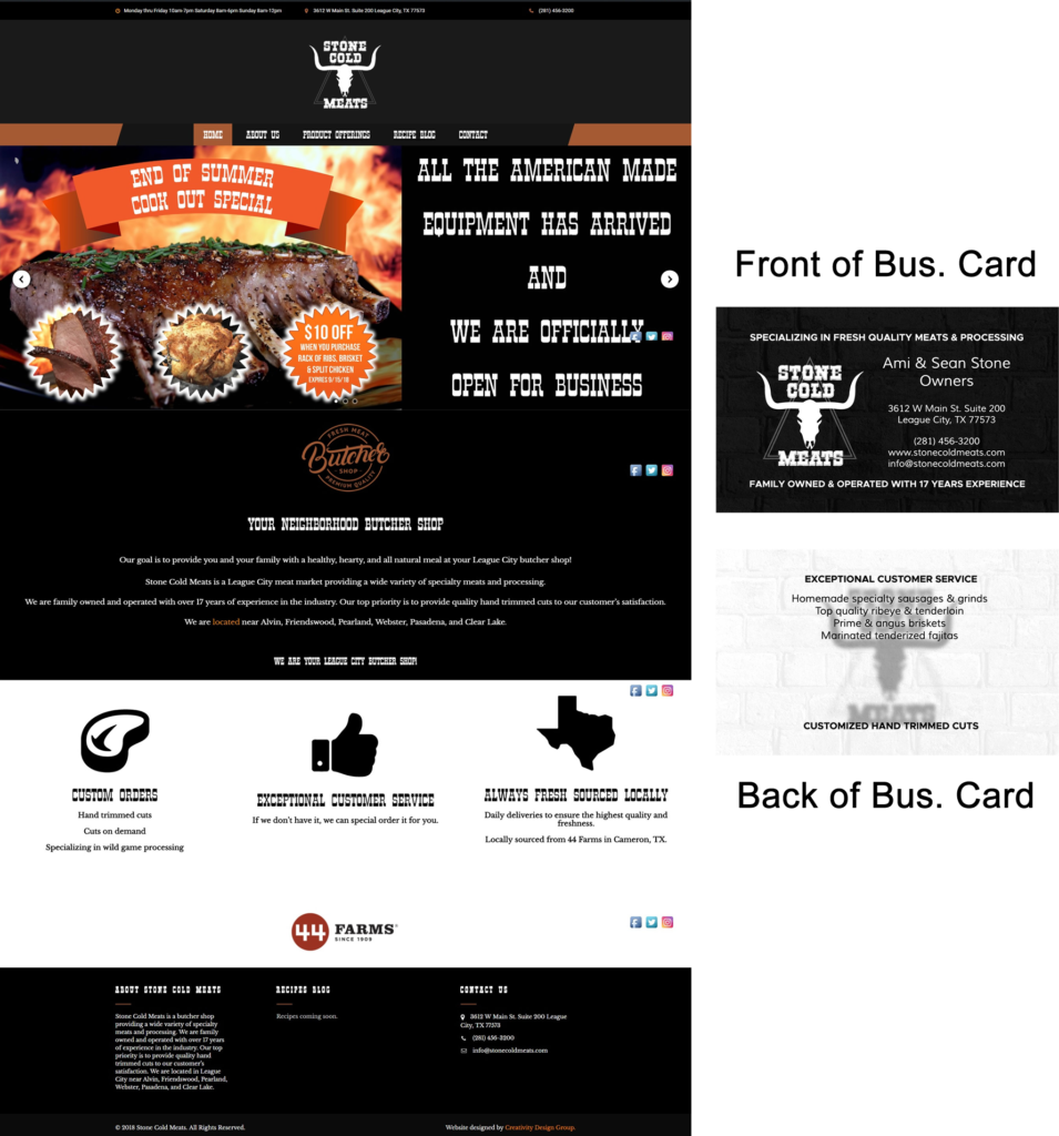
To maintain a professional appearance, always remember that all your marketing materials should consistently follow your company’s branding guidelines. This should have been established prior to building a website or designing any print materials; once you have established your company’s color scheme and typography, then you will want to ensure that your website along with any other marketing materials (such as business cards, brochures, and flyers) are all consistent with these branding elements.

Take a look at this real-world example from our client, Stone Cold Meats in League City, TX. Notice how both their website and their business card designs both use the same colors and fonts.
Look at your competitors’ websites! Can your new website be better than theirs?
No, this is not cheating or stealing! Study your competition and see what their websites use to gain attention and try to find out what works best for them. But don’t simply copy everything they are doing and apply it to your website (this would be stealing!); instead, think about how you can make their methods better when you use them on your own website.
Look at several of their pages and see if you can find out what makes these pages work in terms of looking attractive and possibly converting to successful sales. At this point, start thinking about how your website can beat out your competitors and make their customers come to your company instead!
What are the individual pages of your new website going to be?
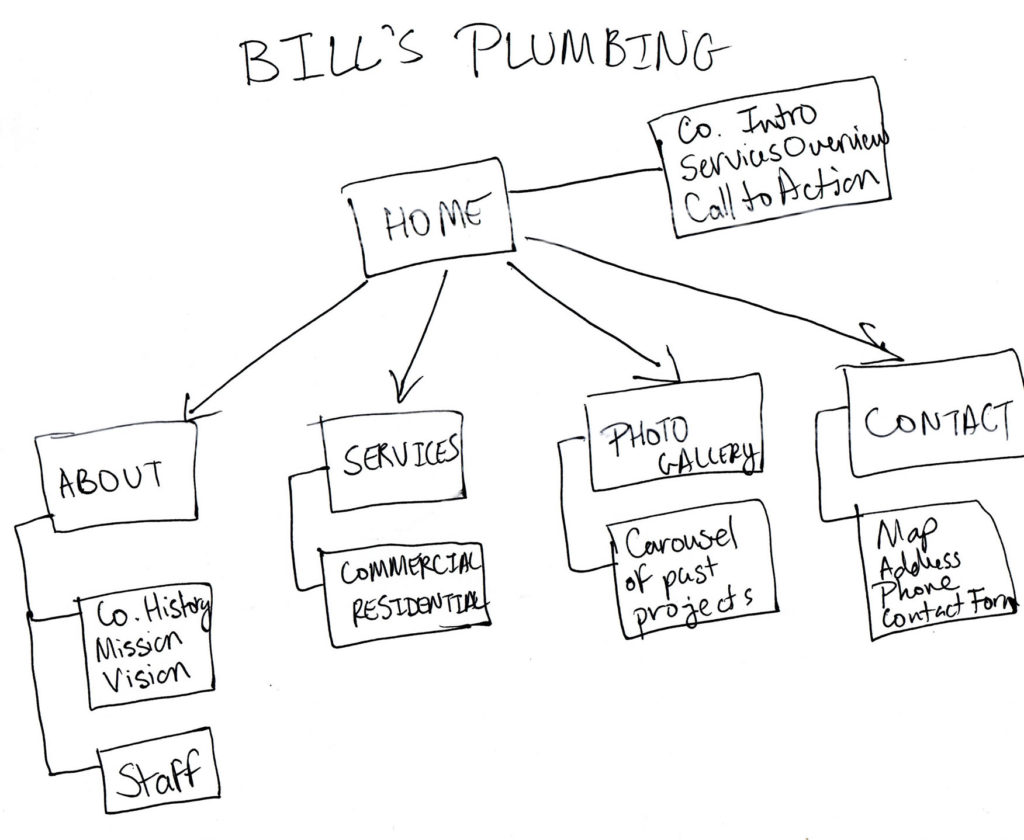
Your new website should contain at the minimum five pages, as this is typical for most websites although not a requirement (a website can have as many or as few pages as necessary). Think about what pages will make up your new website such as the Home page, About Us, Services, Contact, etc. Once you have decided on what each page’s title is going to be, draw a flowchart similar to the one below:

Use the Home page as the main box of your chart, then below it start drawing more empty boxes. These empty boxes will contain the names of the other pages within your new website. Assign one box per page and write the name of said pages in their own box; draw arrows extending out of the Home page box and have one arrow each pointing to the subsequent boxes.
Then, draw another box below each page’s box with a line connecting the two the side (see example above). In these boxes, write down what items/features will be appearing on these pages.
What you have just drawn is the map of your new website, simply known as a sitemap. A sitemap outlines your new website by its hierarchy and in this version, you are including its features.
Once you have completed this exercise, you will have a clear idea of how your website will be structured.
Once You Have Your Page Titles, Start Creating Their Content
You can’t have blank pages on your new website, right? At this point, you need to start writing content for each page. Open Microsoft Word or a similar program and start writing every paragraph and sentence that will go on each page; we recommend downloading and installing the free Grammarly add-on for Word that will help you avoid spelling and grammatical errors.
When writing your content, it is important to keep Search Engine Optimization or SEO in mind; if your content is not optimized properly, then you cannot expect your new website to be found on Google or any other major search engines. We recommend that you check out this guide for more information on optimizing your content properly.
Keep your target keyword (the keyword you want to be found under when people search for you) in mind, as well as your headings and titles as these are very important in terms of SEO.
Make sure that you have a good balance of pictures, graphics, and text. Too much text will bore the reader while too many graphics and photos will overwhelm your reader and may cause them to miss the information they are seeking when browsing your website.
Every photo you use should have your target keyword in its file name; when you have your target keyword in your file name it makes it easier for people to find you when performing an image search on any search engine. For example, take a look at this photo below:

Let’s say you just opened up a pizza shop, and you want to use this beautiful photo of a fresh pizza on your home page. Before you put it on your website, you will want to first give it a filename that contains your keywords in it. The filename is the name of the file as it resides on your computer, and you can change it by right-clicking on it and selecting Rename (on both Mac and Windows).
For this example, a good name for it would be: fresh-pizza-on-table.jpg. If you do a Google image search for “fresh pizza” then this image would have a good chance of showing up due to the exact keywords being present in the filename. Bonus points if you add your location in the file name as well.
For example, if your pizza shop is in Dallas, TX then you simply name the file “fresh-pizza-dallas-tx.jpg”. Make sure to separate each word in the filename with hyphens because Google will not be able to identify the keywords if they are all bunched together (ex. “freshpizzadallastx.JPG”).
When choosing photos for your new website, make sure that you only use photos that you own or have permission to use (if you are caught using a photo that you do not own or have permission to use, you could face a lawsuit from its original owner). You can find plenty of photos for free with no permission required at Pixabay.com; however, using too many stock photos can sometimes create an unprofessional image of your company. Try taking some photos yourself with your phone or camera or consider hiring a professional photographer.
All photos and graphics must be crystal clear, as many modern displays such as Apple’s Retina displays render images at high quality; if your photos and graphics are not crisp enough, they may appear pixelated on devices that use such technology (such as many modern-day iMacs and iPhones).
Also, make sure that you have an editable version of your company’s logo ready for your website as well; editable versions are usually in formats such as EPS, AI (Adobe Illustrator), PSD (Adobe Photoshop), or CDR (CorelDRAW). If you do not have an editable version of your logo, your logo designer will be able to provide one for you.
Set up a domain and web hosting (your new website’s home on the internet)
We previously wrote an article on choosing a domain name for your company; please go and check it out for more details on how to choose one properly. In fact, you should go and read it right after you finish this article as it contains important tips to help you choose wisely!
After choosing your domain name then next, you are going to need to find a hosting platform to give your new website a home on the internet. We recommend that you check out HostGator, Bluehost, or WP Engine as these hosting platforms offer the best reliability and value!
For more information on choosing a web hosting company, we recommend that you read this article for further reading.
DO NOT forget your mobile users!
50% of people who browse the internet are mobile users, so it is important that your website looks great on both desktop and mobile; however, how it looks on mobile devices is the most important. When collecting graphics and photos to use on your new website, make sure they will look nice when they are placed in the website.
For example, avoid pixelated graphics or photos that are too large to fit into a mobile screen. However, if you have photos that you feel may be too large to fit into a phone screen also remember that if you use WordPress, you will be using a platform that will resize your photos according to the user’s screen size (this is known as responsive web design).
It is also possible to serve certain pieces of content exclusively to desktop and mobile users as well; for example, using the Elementor page builder plugin for WordPress you can set which pieces of content will appear on desktop or mobile devices only. Do you have long, horizontal banners on your website? Set those to appear on desktop devices only and have your designers create vertical versions of the same banners to be shown only on mobile devices.
Also, remember to NEVER EVER use Adobe Flash content for any reason. It has not been compatible with mobile devices for many years, and many desktop browsers no longer support it. Additionally, Adobe has discontinued Flash as of December 2020 officially marking the end of the platform for good (and have been urging anyone who has the Flash plugin installed to remove it from their computers).
Conclusion
Now that you have reached the end of this article, you should now have a good understanding of how to get your new website started. If you are ready to get that brand new website going, contact us right away and we will assist you further. Click the button below and get a FREE consultation with no obligations!
[vc_row][vc_column][vc_btn title=”Get your new website started today! FREE Consultation!” color=”danger” align=”center” i_icon_fontawesome=”fa fa-envelope-open” add_icon=”true” link=”url:https%3A%2F%2Fcreativitydesigngroup.com%2Fcontact-houston-web-design%2F|title:Contact%20Us||”][/vc_column][/vc_row]
*Please note that we may collect a commission for any hosting products mentioned in this article. Thank you for your understanding!

