Making email newsletters that generate interest to your reader.
One of the biggest problems with email newsletters is the lack of focus they have on a particular topic. Email newsletters and blasts need to be able to deliver on the promise you initially gave to your subscribers. The last thing you want to do is send out blasts that do not fulfill what was promised to your readers, and you certainly don’t want to send out emails that seem cluttered and unfocused.
Our last blog post focused on getting an email marketing campaign started for your business, and we highly recommend that you read that one first before reading this one.
The first step in ensuring your promise is fulfilled is by deciding what type of emails you want to send. Links to your recent blog posts? Educational tips? Podcasts and videos, maybe? The choices are endless!
Once you have decided what you want your emails to focus on, it makes it easier for you to write the content for them. Don’t just throw random things on an email and send it out!
Before you start writing your content, you need to keep the following guidelines in mind.
Let educational content rule your email newsletters
The last person ANYONE wants to hear from is a pushy salesperson trying to get you to buy their products. Check your own inbox and see if you have endless emails from companies with subject lines that say “TRY THIS” or “LAST CHANCE.”
Chances are you just delete them, right?
If you answered yes, then you are right. Being salesy looks incredibly pushy and sending out emails daily that just focus on trying to land a sale is just plain annoying. You probably get annoyed by salespeople cold calling you or knocking on your door and sending out emails that do these things are just as annoying.
However, if you send out email newsletters that focus on educational content that can help your readers with your products, you are sending them something that has value to it.
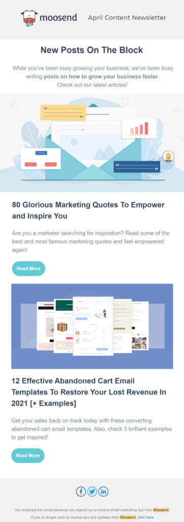
Check out this example from MooSend.

This newsletter they used just has links to two of their latest blog posts, and that’s all they mention in their email. No links to encourage buying or anything promotional, just two articles they wrote that they feel their subscribers would find useful.
Providing educational content shows you and your company have expertise in the field you specialize in and makes your company look more credible. Customers will also feel more comfortable doing business with you knowing that you are willing to help them use your product to their benefit (rather than just your own financial benefit).
Email newsletters with boring subject lines will not have a high open-rate. Be creative and make people want to open yours!
HubSpot has a “recipe” that they have written about on their blog about creating an awesome subject line that will get people to click. Let’s go over each part of the recipe to learn more about it in detail.
Deliverability
There are two ways emails can be blocked in a recipient’s mailbox, either by the SPAM filters or your reader’s intelligence. Many people scan their inbox in just seconds by glancing at it, deciding on what they want to open, and what they want to delete. Certain words and phrases can turn someone off just like that!
You should avoid using salesy words such as “FREE” or “SPECIAL OFFER” because they just make your emails look sales-focused before your reader even opens them. Additionally, never use false promises to make people open such as “Get rich quick” or “Lower your credit score” because many people live by the rule that if something is too good to be true, it probably is. Many scam emails have subject lines making promises that are too good to pass up, so don’t let your emails look like they come from scammers.
Additionally, NEVER use all capital letters or add emojis, punctuation marks, or symbols as they just look unprofessional. Secondly, nobody likes to be shouted at so breaking this rule just creates a sense of unfriendliness.
Actionability
While you do not want to appear salesy, yell at your reader, or make a false promise as we just mentioned, you will want to create a headline that still compels your reader to open your emails.
Writing a subject line for your emails is like writing a call-to-action, so it is important to instill some sense of urgency or make your emails look stimulating.
For example, imagine if you are a huge Chuck Norris fan and live in the Houston area. You are subscribed to a local-area newsletter and this newsletter can have either one of these headlines: “Chuck Norris visits Houston Galleria” or “Meet Chuck Norris at the Houston Galleria at 10 am.”
Which one of these emails would you open? The first one or the second one?
If you said the second one, you are correct! You wouldn’t want to pass up a chance to meet your hero, right? The other headline sounds like something you would probably read later and doesn’t instill any immediate sense of action on your part.
Personalization
If you had read our last blog post about getting started with email marketing, you learned what segmentation is. Segmentation is going to play a key role in this part of the recipe, as it will require you to personalize your emails towards the different audiences within your email list.
Your subject lines need to be personalized towards the group the email was intended for.
Look back at the previous example about Chuck Norris visiting the Houston Galleria.
Would you send out an email with a subject line like this to someone who lives in San Antonio? Probably not, as people in San Antonio would be subscribed to a different newsletter.
Remember, each email you send out is not going to be relevant to everyone, so you need to ensure that your subscribers have the option to only subscribe to what they want to hear about. With that being said, make sure your subject lines are as relevant as possible to your emails’ intended recipients.
Clarity
One way to ensure your email newsletters are opened is by ensuring that your subscribers know what they are about without any questions.
Your subject lines should be clear, concise, and straight to the point without any head-scratching required.
Make sure you write subject lines with keywords that identify exactly what the email is about, without using any fancy language or big words. Plain English never fails, and you can still deliver an exciting message using the most basic of words.
Brevity
We all hate reading long, endless paragraphs trying to find the answer we’re looking for on some random website, right?
That same feeling applies to your subject lines, too. Nobody is going to read a long-winded line of text that goes on forever; people want to know in just 2 seconds what your email is about. As we mentioned earlier, people scan their inboxes quickly to detect what to read and what to delete.
The rule of thumb you should follow when writing a subject line is to keep it within 50 characters or less.
This is especially important for readers who are on mobile devices, as long subject lines will appear cut off, which will just create a bigger mystery for them. Don’t expect any of your mobile readers to even open an email with a long subject line. Ensure that your subject line is fully visible to mobile users, so they don’t have to second guess what your email is about.
Additionally, keep the “above the fold” rule in mind. It is very similar to how people will open a website, take a few seconds to decide if they want to check it out or not, then click the Back button if they don’t like what they see.
This same principle applies to your subject lines. If your readers do not like what they are seeing, either because it doesn’t go straight to the point or is too mystifying, then they are going to delete it from their mailbox.
Consistency
This is the one thing we cannot stress to you enough! We have said numerous times that your emails need to deliver on the promise you initially gave to your subscribers on your website.
The subject lines need to be consistently in line with such initial promises and need to inform the subscriber that the content of your emails reflects those things.
Remember, honestly is ALWAYS the best policy! NEVER bait and switch your readers by promising them one thing in the subject line but showing something completely different in the email’s body copy. That will just lead to a very high un-subscription rate! Lying to the public is the easiest way to destroy your image and can ultimately hurt your business.
Design should aid, not distract from the main message.
Just like with website design, the look and feel of your email newsletters and blasts need to have a design that aids in conveying the main message at hand to the reader.
Your email newsletters may have more than one call-to-action, and that is alright; however, they should not all be equal in terms of importance. Your main call-to-action should be the most prominent one and the end-user should be able to identify it easily.

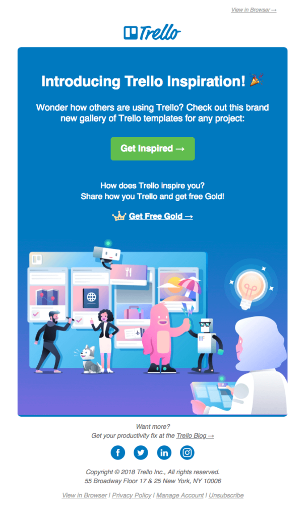
Look at this example from Trello.
It has a fun design with eye-catching visuals, and the message is conveyed without being too wordy; secondly, the colorful graphics do not detract from the main message either. Can you identify what the main call to action is?

If you guessed this button, you are correct!
Trello wants its readers to try out Trello Inspiration, their library of templates that can be used for Trello projects; their main message in this email is to get their readers to quickly understand what Trello Inspiration is, then try it out immediately.
The secondary call-to-action has less prominence and does not stand out as much as the green button; this would be the link labeled “Get Free Gold.” While Trello does want its readers to also click on this link, it is not their top priority to get them to click on it.
Finally, the third and less important call-to-action within this email is at the very bottom just above the social media icons. This would be the link that says “Trello Blog”. Notice how it does not stand out very big and is rather easy to miss; that is because Trello does not consider this call-to-action important as the other ones focus more on getting their users engaged with their products.
In general, your email’s body copy should not be intrusive or too wordy. You should write just enough text to get your main message to the reader conveyed. Nobody wants to sit and read long paragraphs all day!

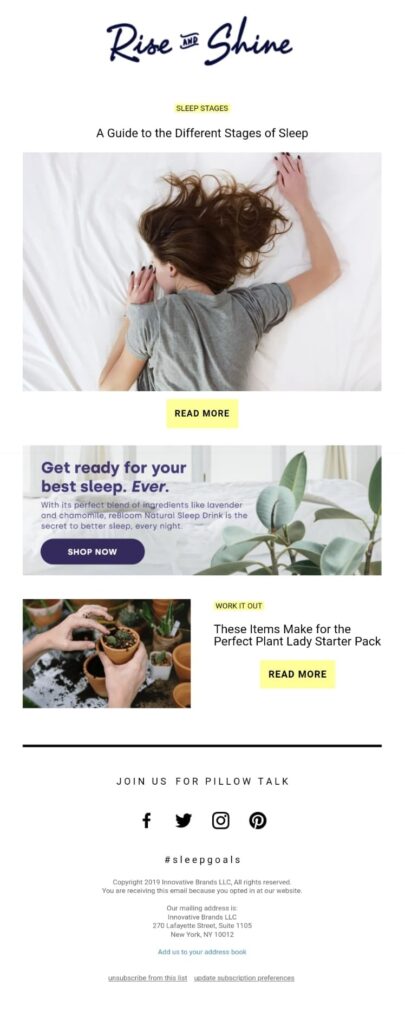
Check out this next example from Rise and Shine.
Notice how it starts with only a headline, a picture, and the call to action. All the reader sees is “A Guide to the Different Stages of Sleep”, with a picture representing the topic, and then the call-to-action.
This is simple, short, and straight to the point! It tells the reader everything they need to know to understand what they would be reading about if they choose to click the call-to-action button.
This same tactic is reapplied at the bottom of the email where it says: “These Items Make for the Perfect Plant Lady Starter Pack.” All the reader sees is the name of the blog post, a relevant picture, and the call to action. Nothing else needs to be done here to convey the message.
Most importantly, the promotional portion of the email (the Shop Now button) does not interrupt the main message at hand. By incorporating two educational pieces and only one promotional piece, the email shows it is focused on helping its customers rather than pushing a sale onto them.
ALT text on images within your email newsletters
This is very important! ALT tags are very important on websites for two reasons: SEO and helping the visually impaired. While the former reason does not apply to email newsletters, the latter certainly does.
When designing your email newsletters and blasts, whether it be by hand in HTML or within an email marketing platform, make sure to give your email’s images the appropriate ALT tags. Describe what each image is and if the images contain words make sure to include those words as well.
Conclusion
Once you have done all these steps and have taken each piece of information from this post in mind, you are almost ready to go.
Why “almost?”
Because once you have created your email newsletters and their content, you need to test them out with different people to get feedback on what they think of them.
Before sending them out to your subscribers, ask family and friends to see what they think of them. Consider A/B testing of two versions of the same email and see which one gets the best feedback.
We would love to help you get started on your email marketing campaigns. Would you like us to look at your existing campaign? Contact us today for a FREE consultation, including a critique of your current set of emails!


