As the holidays get closer and closer, are you getting your online store ready? We have an eCommerce optimization guide ready to help you but first, check out our previous blog post. Two blog posts ago, we wrote an article on how to provide your users with a stellar user experience within your store (we highly recommend that you read that post first).
This week, we want to focus on some eCommerce optimization tips to help you fine-tune your online store even better. Let’s get started!
One of the most important eCommerce optimization tips: Search Engine Optimization!
Keep in mind that while this guide focuses on eCommerce optimization tips, these SEO tips are applicable to any type of website (not just online stores!).
Place the correct keywords in your URLs
To start, you should ensure that the canonical URLs for each page within your site are search engine ready. They should include the exact keywords that you know your visitors are typing in the search box. Let’s look at the following examples:
https://www.myhatstore.com/productid=15789
Example A
https://www.myhatstore.com/product/green-baseball-cap
Example B
Which one of these is both easier to understand by a human person AND easier for Google to pick up keywords from?
If you chose example B, you are correct!
Example A has an incredibly cryptic looking URL and does not contain any keywords in it while Example B contains the words “green baseball cap” within it. If someone searches for “green baseball cap” within Google, then Example B has an easier chance of being found on the SERPs (Search Engine Result Pages).
Make sure your URLs include the keywords that you know search engines will pick up. If the URLs contain nothing but a long string of numbers, letters, and symbols then there is a good chance it will not show up in any search results.
Don’t forget to give your images ALT text!
ALT descriptions have two purposes: to show text in place of images for visually impaired users using screen readers AND to help Google and other search engines find and index your images based on the keywords written in these descriptions.
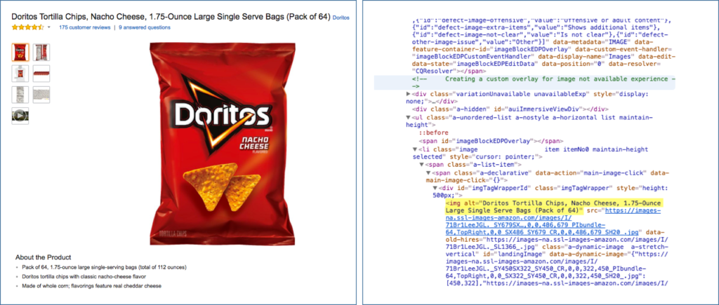
Take a look at this example. On the left, you will see a picture of a bag of Doritos being displayed within a website and on the right is the HTML code that is being used to display the picture.
Take a close look at the highlighted portion of the code. Notice that the ALT text describes the product and all its attributes and even mirrors the product’s exact name.
Because Google and other search engines cannot scan the text within images or graphics, they can instead scan their ALT descriptions for relevant keywords. It is important that the keywords you want to rank for are placed within these descriptions; it is recommended by Yoast SEO to only do this for 30-70% of the images on your page.
Place important keywords in your page titles and meta descriptions
Page titles are the words you see in the browser tab of an open webpage; they are also the words that make up the link to your site in the SERPs. For each page, make sure that the keywords that you want these pages to rank for are written into their titles.
Include proper keywords, location (if you are focused on serving a certain geographical location), and be as straightforward as possible.
Meta descriptions are the paragraphs that you see underneath each individual search result; their purpose is to describe what the page is all about.
Just like with titles, ensure that you include the same important keywords that you know your audience is typing. When writing a meta description, make sure it is informative and give an enticing reason why they should click on it.
Take a look at this example below:
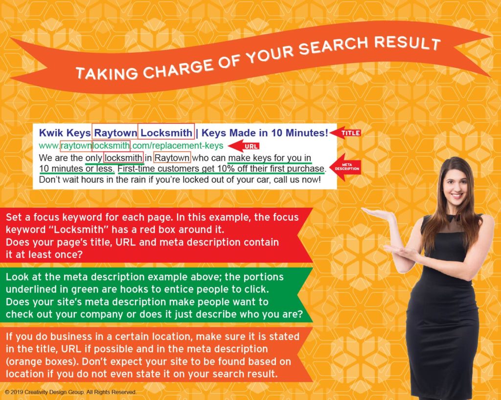
This graphic sums up everything that you need to know about how to write a perfect title, URL, and meta description.
Make sure that your search result looks very similar to this one; remember to be straightforward, enticing (cannot stress this enough), and easy to read. More importantly, make sure that your search result provides the answer to the question your audience was using Google to find! Do not just simply look like every other result or it will just blend in with your competition!
As we move onto other eCommerce optimization tips, please remember that SEO is certainly the most important one out of all of them!
Optimize Your Product Pages
Use breadcrumbs!

Breadcrumbs are a second set of navigation links shown at the top of each page; they outline which page you are on in addition to the family of pages it belongs to (its preceding pages).
This is a major eCommerce optimization tip because it prevents your users from getting lost within your site. If you sell several different products under different categories, then you would be crazy not to have breadcrumbs! Without them, your visitors will just get lost!
Remember the SEO tips from the previous section!
Remember that the URLs, titles, and meta descriptions should contain the most important keywords! You want to ensure that your product pages can be indexed so they can start ranking on Google; remember that you want to use the keywords that you know your customers are typing in. We recommend using the free Wordtracker tool to perform an analysis of different keywords and phrases.
Product page best practices
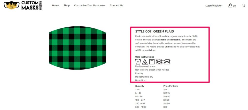
Make sure that your product description paragraphs contain as much information about the product as possible. Think of every question that your customer may have before purchasing it, and make sure that you answer them! Cover all important product specifications and usage information.
Take a look at this example from CustomMasksHouston.com, our website where we sell custom face masks. We make sure to cover what the masks are made out of, how to use them, and information on how to clean them.
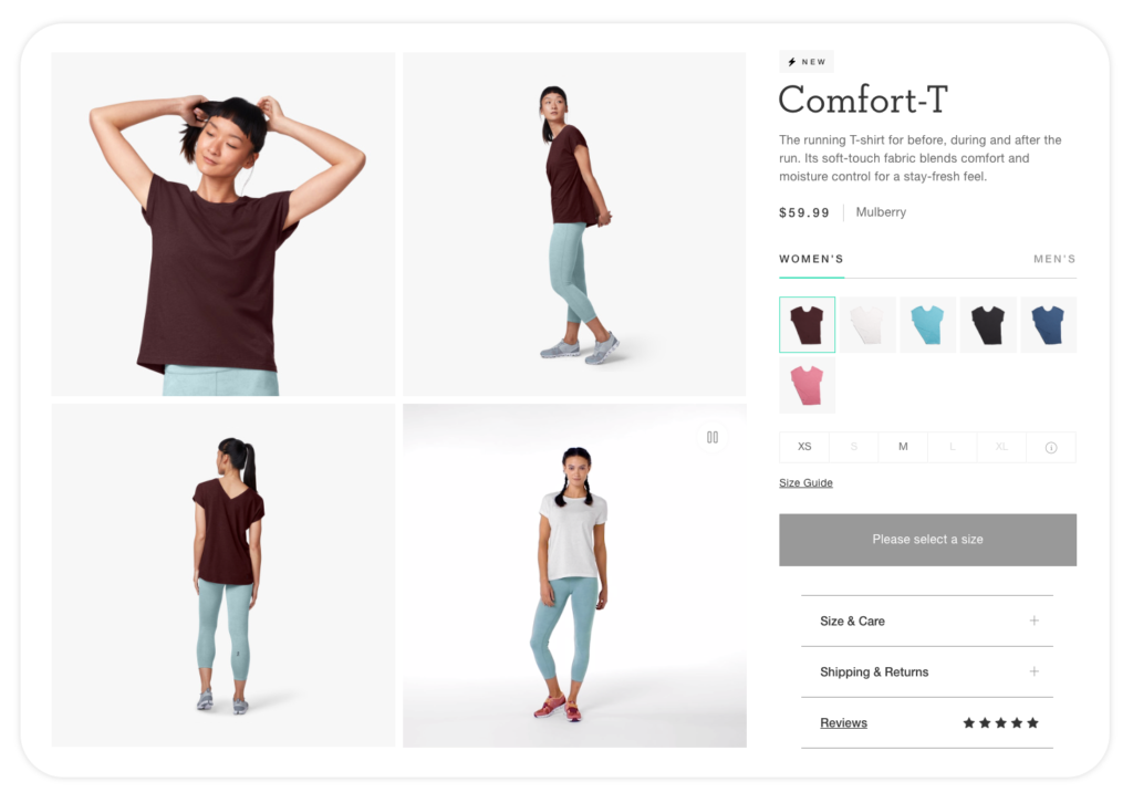
Do not forget to add pictures! The best practice for displaying images is to show all sides and any areas within the product. For example, if you are selling a backpack then show what it looks like inside of it as well as in the pockets. The more your audience gets to see, the more you will pique their interest.
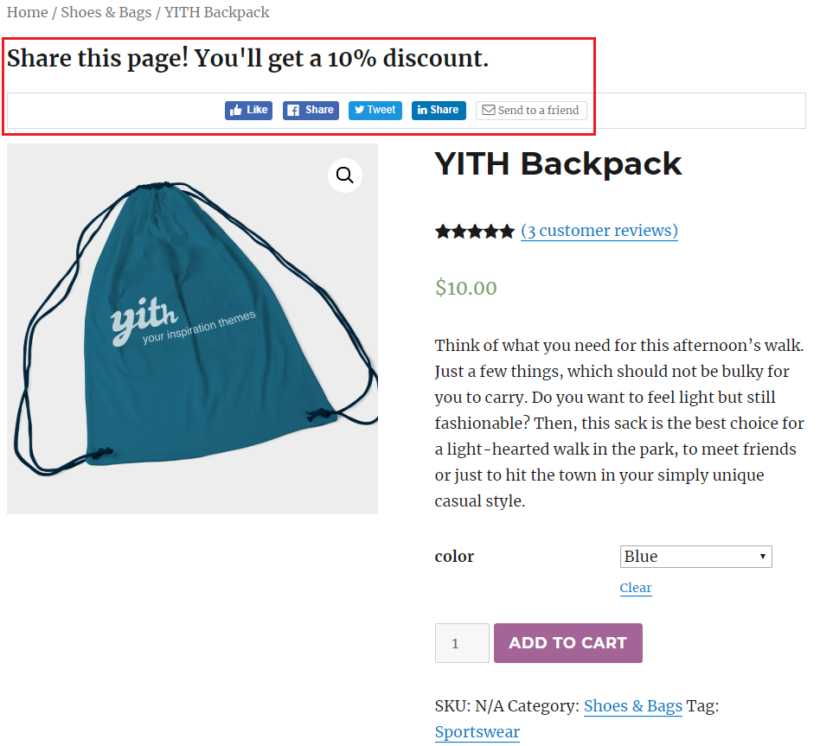
Double-check and make sure that your customers can leave reviews! If your customers are leaving great reviews on your product, then the rest of the world needs to know so they can start buying too! Also make sure that you have social sharing enabled, so your customers can share their reviews as well as the products themselves with the world (which can lead to more sales!).
Using WooCommerce? Check out this guide to learn how to enable reviews on your site. Also, check out the Super Socializer plugin to allow social sharing!
Getting Your Pricing On-Point! (Another extremely important eCommerce optimization tip)
Make it easy for customers to compare products!
You do not want to overwhelm your customers with tons of product options without allowing them the ability to compare them clearly. If your customers must have their products open in different windows and tabs, it will only make it harder for them to compare their options.
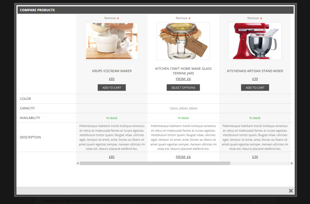
Instead, allow customers to compare all their options within one page so they can read about them side-by-side. In one window, customers should be able to read about each individual product’s pricing, description, features, and benefits all at once. This is not easy to do if customers are switching between windows and tabs!
WooCommerce users, you can do this easily with the YITH WooCommerce Compare plugin!
Simple, easy to spot call-to-actions (not just eCommerce optimization, but marketing optimization!)
Using a clear, concise call-to-action is not only an eCommerce optimization tip but also a major one for anything marketing related! After encouraging your customers to take action, they need to be able to do it!
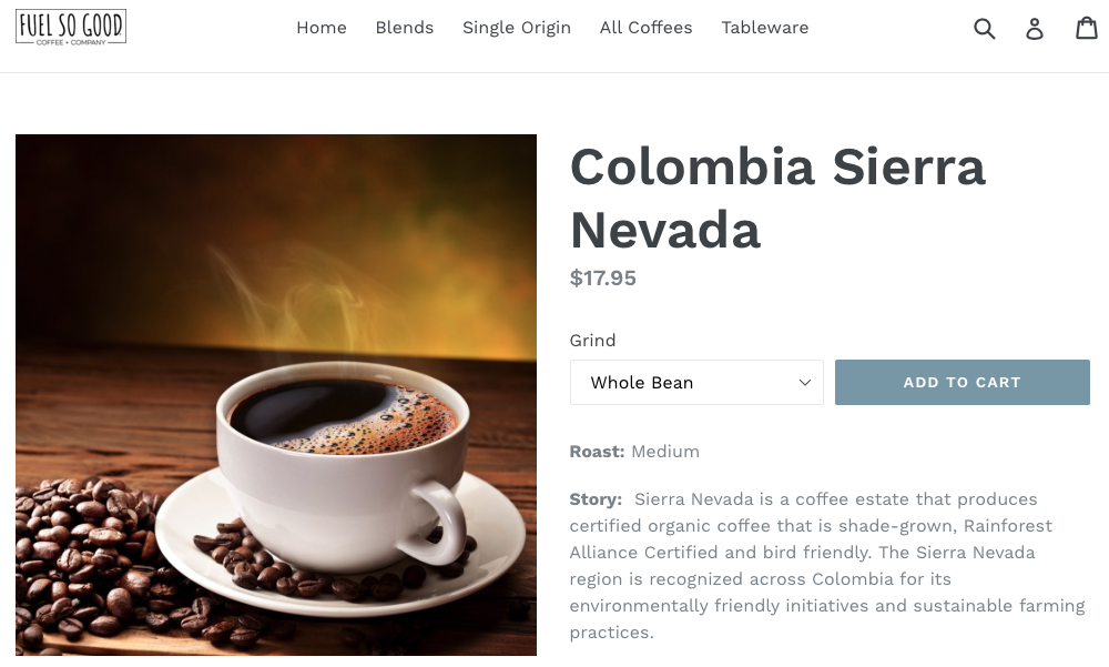
Take a look at this example from the Fuel So Good Coffee Company. Notice how the Add to Cart button is in blue and is very eye-catching due to how the dark color contrasts against the white.
Additionally, the wording “Add To Cart” is simple and straightforward. Do not create confusing call-to-action buttons that have tons of wording; be straightforward! Use phrases such as “Buy Now”, “Add to Cart” or “Order Now.”
Use tiered, or multi-level pricing
If you are selling a product or service that has more features or benefits by levels, then you will want to specify that upfront!
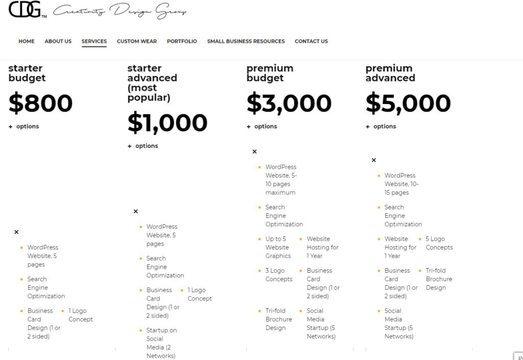
Check out this example from our services page. We list out each of our marketing packages in columns, specify the pricing, and then list out what is included in each package depending on their level. If you sell one product or service that offers different things by levels like this, make sure you list all of them out in a clean chart or list. This goes back to what we said earlier about making it easy for customers to compare products without jumping all over your website!
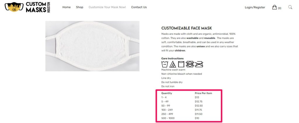
Similarly, you can use the tiered pricing method to do the opposite! Encourage your customers to buy your products in bulk (if applicable) by lowering the price per unit if they purchase large amounts. Take a look at this example from CustomMasksHouston.com; as customers buy larger quantities of masks they can expect to pay less per unit.
Live chats can help you increase sales quite a bit! (eCommerce optimization meets customer service)
Even though your product pages should be able to answer every customers’ questions, you will always get a customer who may have a question that was not answered anywhere on your site.
According to this article from Kissmetrics, being able to ask presales questions can result in a 38% conversion to a sale!
How do you answer a customer’s question quickly and easily? By connecting your customers to a live person using a live chat feature! You should always have one that sits in the lower right-hand corner of your site, where a customer can simply click and wait for the next available representative to speak with them.
To reduce the workload on your customer service team, consider setting up a chatbot that can answer customers’ questions automatically! It is a great way to answer their questions when an agent is not available (such as during non-business hours) but keep in mind that a computerized robot can only do so much. Chatbots should not replace live customer service agents in any way!
Encourage buying with flash sales
A flash sale is the type of sale that encourages customers to buy right away before it’s too late; it is a sale that runs on an extremely limited amount of time and can be missed if you don’t act right away! They are a great way to create a major sense of urgency and can instill the fear of missing out, or FOMO for short.
How can you promote a flash sale on your site easily? Let’s take a look!
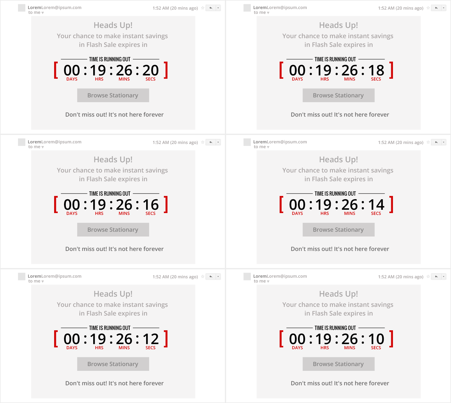
This sample popup that was made with the Finale WordPress plugin instills a sense of urgency by letting the customer know the sale is running on an extremely short amount of time.
To encourage the customer to act, a countdown timer displays exactly how long they have to act before the sale is gone forever with a nice call-to-action button to browse products directly below it. Finally, the tagline “Don’t miss out! It’s not here forever!” also adds to the urgency by warning the customer that once this deal is gone, it is gone forever.
When advertising a flash sale, remember to showcase the items in this list:
- Time remaining before the sale ends
- For physical products, show the live numbers of the inventory decreasing or the number of units sold
- Compare your price to a competitor’s
- Call-to-action with an urgent caption
- Urgent bylines such as “Get it now before it’s too late” or “Once it’s gone, it’s gone forever!”
Have these popups show up when a user is getting ready to close their browser tab or close the entire browser (known as an Exit-Intent Popup); it will give them one last chance to act before they leave your site forever. Remember, once a user clicks that back button you have lost a customer for good!
Be upfront about additional costs or policies (eCommerce optimization meets honesty!)
No one likes nasty surprises! If you have to charge your customers additional fees for things such as shipping or other related costs, make sure you let them know right away. In fact, this article from 3dcart states that the majority of shopping carts are abandoned due to shipping costs!
Whenever it is financially possible, consider offering free shipping. This will involve reviewing your pricing strategy, which could result in marking up a product’s price to include shipping costs. But whenever you must charge additional fees such as shipping, gift wrapping, handling, etc. make sure the customer knows about this ahead of time!
You can specify such additional charges on your product’s pages, in your customer service section or anywhere that is upfront and hard for anyone to miss. Alternatively, implement this same strategy when advertising freebies included with purchases (shipping, gift wrapping, free gifts, free add-ons, etc.) as this certainly can encourage more sales! Remember, one of the most attractive words you can use in marketing is the word “FREE”!
Showcase Security & Trust Seals
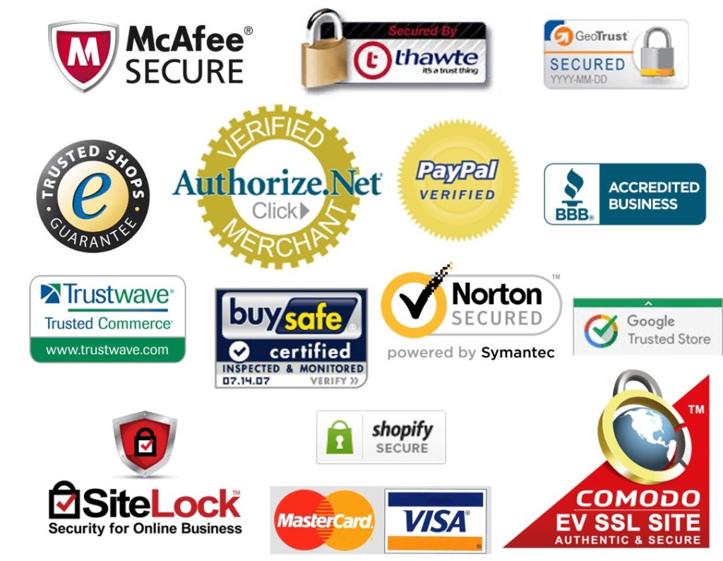
You may have seen seals like these within several online stores you may have shopped at in the past. These security seals inform customers that the site they are shopping on is safe and that their personal information (such as addresses, phone numbers, and credit card numbers) is safe from being compromised and stolen by hackers.
Of course, simply placing these seals on your site does not automatically make your website safe. Before running any online store, you need to have an SSL certificate (this is not only an eCommerce optimization tip but rather a mandatory requirement for all online stores!). An SSL certificate ensures that information transmitted to and from your website is handled securely; you should NEVER run an eCommerce site without it (or any site for that matter, as Google also considers SSL certificates a ranking factor).
Your SSL provider should be able to provide you one of these seals; you can place them in areas such as the footer of your website or on checkout pages. When customers see this seal along with the padlock icon in their address bars, it instills a feeling of trust in them!
Conclusion
Now that you have read about some quick eCommerce optimization tips, you are now ready to give your customers a shopping experience they will never forget! Always remember while working on your site to keep your customers in mind and look at it from their standpoint.
If you need help with anything in these articles, we would love to give you a hand. Contact us today for a FREE consultation so you can start making your customers happy!
[vc_row][vc_column][vc_btn title=”Improve your website today!” color=”danger” align=”center” i_icon_fontawesome=”fa fa-envelope-open” add_icon=”true” link=”url:https%3A%2F%2Fcreativitydesigngroup.com%2Fcontact-houston-web-design%2F|title:Contact%20Us||”][/vc_column][/vc_row]

