With the holiday season quickly approaching, you will want to ensure that your eCommerce site or online store is ready to handle a major influx of traffic. Due to COVID-19, you can expect to see even more people shopping online instead of at the mall or the stores so it will be incredibly important to make sure that your visitors have the best experience possible on your site.
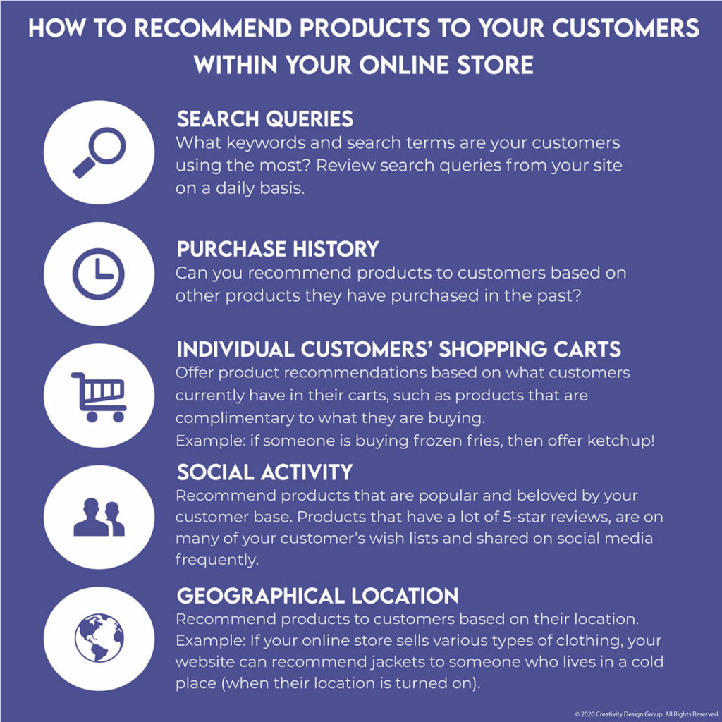
One of the most important methods of making your customers happy is ensuring that they have a personalized experience while shopping at your online store. One way of doing so is by recommending products to them using these simple methods:

- Search Queries: By analyzing what search terms and keywords are popular with your customers daily, you will be able to determine which products to start recommending to the public. Products with high demand should have prominence on your site’s home page to ensure that visitors who are seeking it can find it immediately!
- Purchase History: Customers who have individual accounts within your store should be recommended products that are based on purchases they have made in the past. Let’s say you own a bookstore as an example: you have one customer who purchased a book on learning Adobe Photoshop; your store can recommend this same customer a book on Adobe Illustrator to compliment their Photoshop book they purchased previously.
- Individual Customers’ Shopping Carts: This method of recommending products to customers involves trying to upsell them a product that can complement the items they currently have in their shopping carts. Bought a gallon of ice cream? Then recommend some waffle cones to go with it!
- Social Activity: Here you will want to analyze consumer behavior within your store just like you would have done with search queries. Take a look at the products in your store that are extremely popular (look at their reviews, customer wish lists, and shares on social media) and place them prominently on your home page and watch the money come rolling in!
- Geographic Location: This method can be a hit or miss depending on how many of your customers have their location turned on in their browsers and phones, but it is possible to recommend products to your customers based on where they are located. For example, a clothing boutique can recommend jackets to someone who lives in a cold area like Canada.
Testing your eCommerce site’s performance
In order for your customers to have a flawless shopping experience, it is very important to ensure that your eCommerce site is well-maintained, up to date, secure, and ready to handle a surge in traffic. Remember, more people than usual are going to be doing their shopping online this year so it is important to ensure that your eCommerce site is more than ready to handle extremely large amounts of online traffic.
Make sure your eCommerce site has an SSL Certificate!
If it does not, then why are you even running an online store? An SSL certificate encrypts (transmits securely) all of the information being handled by your website such as customer information, credit card numbers, and other sensitive pieces of information; additionally, Google is penalizing sites that do not have one by pushing these sites further down the search results (or removing them altogether!) so it is of paramount importance to have an active SSL certificate installed on your website. Contact your hosting company to verify that you have one; many hosting companies offer them for free in most of their hosting packages.
Make sure your eCommerce site loads within 3 seconds or less!
If your website does not load within this timeframe, the results can be disastrous! First, any site that does not load fast will result in you losing several customers because they chose to go somewhere else; secondly, Google also penalizes websites that are slow in the same manner as they do with sites that do not have an SSL certificate. Test out your website’s speed by using GTMetrix, a free tool that will analyze how long it takes to load; the final report GTMetrix generates includes information on any problems causing your site to load slowly and tips on how to fix them.
Test out your eCommerce site with your friends before launching!
Whether your site has about to launch or is already live, it can never hurt to find out what others think about it. Have your family and friends look at your website themselves and ask them to browse through it as if they were real customers.
Ask your test users what they liked about their experience? More importantly, ask them what they hated about their user experience and find out what you can do to make the overall experience better! Were your test users able to locate the sections of the website they were seeking or the products they were looking for?
These factors should be taken into consideration when evaluating your visitors’ user experience:
- Navigation: Check to make sure that your site is extremely easy to browse through; the best way to do this is in a silo structure which will interlink all of your site’s content together AND help improve your site’s SEO.
- Clarity: Ensure that each page on your site (especially the home page!) is clean, straightforward, and free of any distracting elements. Any graphical elements used on your page should aid, not distract from the message being delivered! Avoid using videos that play automatically or background music as these things can startle users and scare them away.
- Simple Shopping Cart: The shopping cart should be so easy to navigate and manage that a child could do it! The fewer steps your checkout process has, the better! More on this to follow later.
Showcasing the most important products properly
Once you have determined which products and categories appear to be the most popular or plan to put a specific focus on, you then need to decide on how you will promote them.

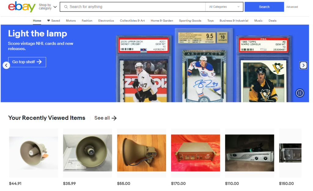
Take a look at eBay’s home page as an example. Notice how they have a slider at the top that has multiple messages; in this case, they are putting an emphasis on selling vintage NHL trading cards. The pictures are the most prominent aspect of the graphic and more importantly, it includes a call-to-action button to encourage people to click right away!
Additionally, eBay personalizes the user experience even more by displaying their recently viewed products (as a method to regenerate customer interest).
On your own eCommerce website, consider using a slider as one method of promoting the products you really want to sell. You can add as many slides as necessary if you plan on focusing on more than one product, but DO NOT FORGET to add a call-to-action! Without a call-to-action button or link, these slides are basically useless!
Secondly, consider setting up a dedicated section of your website to showcase the products you really want to sell. You can call this page “Featured Products” or “Hot Sellers” as an example; separating the high priority products from the low priority ones allows the user to focus on the former category over the latter better.
The Search Results Within Your eCommerce site
You will want to ensure that your site’s built-in search engine will be able to display results as accurate as possible.
First, you will want to make sure that your site’s search engine can tolerate human errors easily and offer spelling corrections when someone misspells a word; by doing this, you are avoiding possible losses. Do not expect to make any sales if someone’s typo results in zero results.
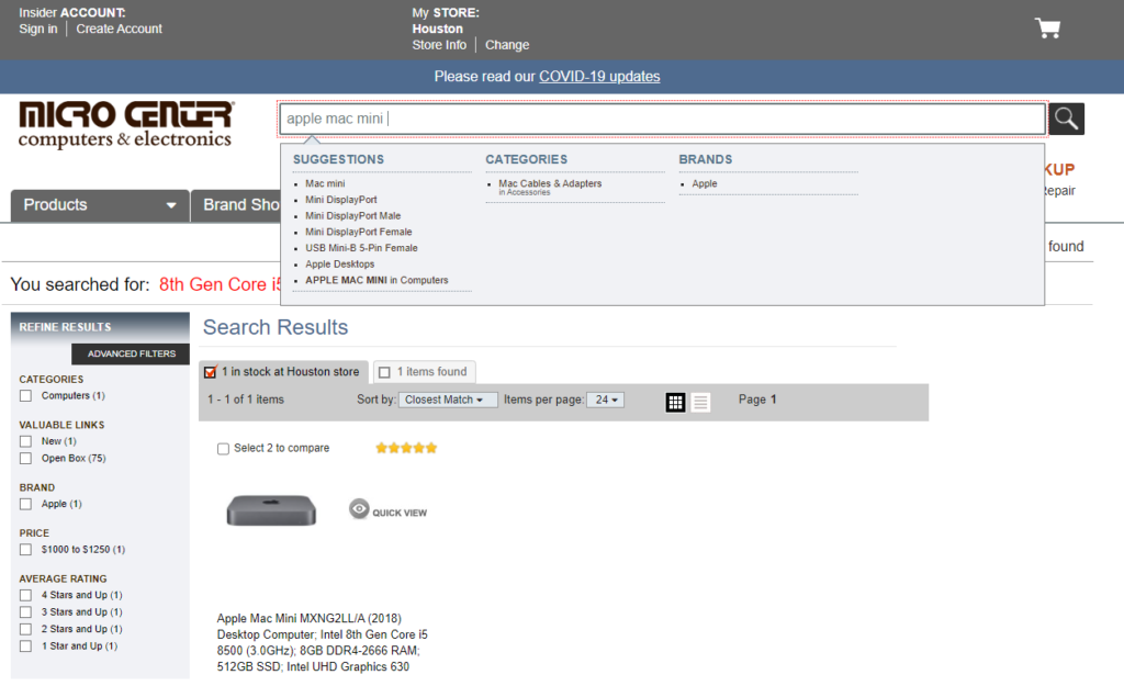
Secondly, when a customer starts typing something into the search bar it should have a drop-down menu appear instantly offering search suggestions. If a customer is searching for a specific product, then you should have either a link in the drop-down that goes directly to that product OR a link to the category the product is placed in (see example below from Micro Center’s website).

In Micro Center’s website, typing in “apple mac mini” instantly shows a dropdown menu with product suggestions AND categories. Implementing this strategy within the search box of your website is a great way to help your customers find EXACTLY what they want without getting lost or digging through several results. Don’t risk losing a sale because your site’s search engine has poor usability.
Seamless Checkout Pages
Earlier in this article, we mentioned that you should have as little steps as possible during the checkout process. Now, we will go over some tips to help you streamline the process for your customers better to avoid cart abandonment which will then result in lost revenue for your company.
Make sure your shopping cart is extremely simple!

Take a look at our website where we sell custom face masks, CustomMasksHouston.com. When we designed this website, we made sure that we developed a checkout process that only takes about two clicks minimum when the customer is ready to pay for their purchases.
While a separate shopping cart page is present, we reduced the checkout process one less page by adding a shopping cart sidebar that contains an overview of a customer’s purchases with options to edit the order. This sidebar is accessible by clicking on the shopping basket button in the lower righthand corner of the page; as an extra convenience, this button and sidebar appear on every page within the website so the user can access their cart and make changes at any time without having to search the entire site for the shopping cart.
Ensure that you have a shopping cart within your eCommerce site that can hold every purchase a customer is making; if your site only allows a customer to make one purchase at a time, you are only frustrating them and putting your own company at risk of losing huge sales!
ALWAYS ensure that your eCommerce site has an option for guest checkout!
This also can help reduce the number of pages your eCommerce site’s checkout process uses; having a guest checkout option enables customers who do not wish to make an account on your store make sales without any hassle!
If your store does not have an option for guests who do not have an account to checkout, you are also putting your company at risk of losing revenue because your customers who are looking to make quick purchases may not be interested in going through the process of making an account due to the extra steps that would require (such as filling out a form and verifying their emails).
While having an account on your site has several benefits such as order tracking and the ability to save credit card information, there are users out there who simply just want to purchase their products and move on. Ensure that your eCommerce site offers a guest checkout option to your customers to ensure that you do not lose out on possible sales from customers who do not wish to make an account.
Make sure you offer several payment options!
One of the easiest ways to lose out on sales is to have very few payment options available. How many sales do you expect to make if you only accept American Express cards?
Your store should accept payments from all major credit cards, but also take payment options such as Google Pay or Apple Pay into consideration as well. Many of your customers most likely are interested in paying with these options instead of credit cards due to preference, so ensure that your site has as many possible methods for taking payment.
One popular method many eCommerce websites use is PayPal; PayPal gives users the option to store as many credit or debit cards on their account as needed and allows customers to choose the card they wish to check out with. Additionally, PayPal is secure so processing transactions with it gives an additional layer of security to your own checkout process. PayPal is free for both merchants and customers and the only thing they will charge you are their merchant fees (more info here).
Offer multi-recipient functionality
This simply means that your eCommerce site should have the ability to allow customers to buy products for people other than themselves. You may have seen how many online stores display a form during the checkout process that asks for both shipping and a billing address.
Since the holiday season is coming up, having multi-recipient functionality will be extremely important since many customers will be buying gifts for their friends and family. Without multi-recipient functionality, expect your site to lose out on sales due to the lack of ability to separate the billing address from the shipping address. Make sure that your eCommerce site offers this option to customers!
Get assistance with your eCommerce site today!
After reading this article, you should now have an idea of what your eCommerce site needs in order to offer your customers a fantastic user experience. The time to start fixing your website is NOW as many people are already thinking about the biggest shopping season of the year! If you have questions or need assistance getting your website ready, we are here to help. Click on the button below to get a FREE consultation from CDG and we will evaluate your website’s current setup at NO charge!
[vc_row][vc_column][vc_btn title=”Improve your website today!” color=”danger” align=”center” i_icon_fontawesome=”fa fa-envelope-open” add_icon=”true” link=”url:https%3A%2F%2Fcreativitydesigngroup.com%2Fcontact-houston-web-design%2F|title:Contact%20Us||”][/vc_column][/vc_row]

