The homepage is the most important page on your website. It is the first thing people see when they pull it up, so it is important that it makes a perfect first impression! Remember, first impressions count and if the first one you make on someone is a bad one then you have permanently ruined your image to that person!
There is a difference between simply having a homepage and having a homepage that can convert your website’s visitors into long-time customers. Let’s look at how you can utilize your homepage to increase sales conversions.
Focus only on one Call-to-Action
If you have a website that has been built already, have someone you know go onto your website and have that person pretend they are a customer. Have this person go through your homepage and study how long it takes for them to find any call-to-actions you have and click on them.
You might discover that if your homepage has more than one call-to-action, the user might feel overwhelmed and leave your website without any engagement whatsoever.
Think about what you want your visitors to do when they come to your homepage. Request a free consultation? Download a whitepaper? Maybe even subscribe to your email newsletter?
A great call-to-action will convert your site’s visitors to customers, while a boring/mediocre one will just result in them leaving your website for a competitor’s. Always remember that once a visitor clicks on the back button, they are gone forever!
According to Ellie Mirman the Vice President of Marketing at Toast, using only one call-to-action increases engagement by 371% and sales by 1617%; with that being said, make sure your homepage only has one call-to-action (that is incredibly irresistible and enticing!).
However, to expect such a high engagement rate with your call-to-actions, your visitors must be able to find them to begin with!
Your homepage should be very short and simple and only include elements that are extremely important. Remember, you do not have to explain everything in detail on your homepage; you should use other pages of your website to explain other aspects of your company in detail.
You especially should avoid using large, lengthy paragraphs on your homepage as this will completely bore the reader; also keep in mind that visitors do not want to scroll endlessly to get to the point. Your homepage should be straightforward, without any fluff!
According to this case study conducted by ConversionXL, websites with shorter homepages convert better than websites with extremely long ones.
In short, make sure your website’s homepage is condensed down to make it quick and easy for your visitors to find your call-to-action whilst still answering any questions they may have about your company.
Your Homepage Should Have Eye-catching Headlines
The headlines on your homepage should instantly grab the attention of your readers; headlines do not necessarily have to be catchy, just enticing. Remember that boring headlines will not generate any interest in what you have to say; conversely, a headline using words that create emotion will get people to act!
Kristen McCormick at Wordstream has prepared this article on which words and phrases you can use to create such emotion; we recommend that you check it out as it is a great resource for both headlines and your website’s content in general.
According to this article from Entrepreneur magazine, it takes less than two-tenths of a second for a visitor to form an opinion of your brand once they look at your company’s website. Within that time frame, you must be able to explain all of your selling points and communicate value to your visitors or they will click that back button and never return!
Let’s look at some examples of effective headline use.
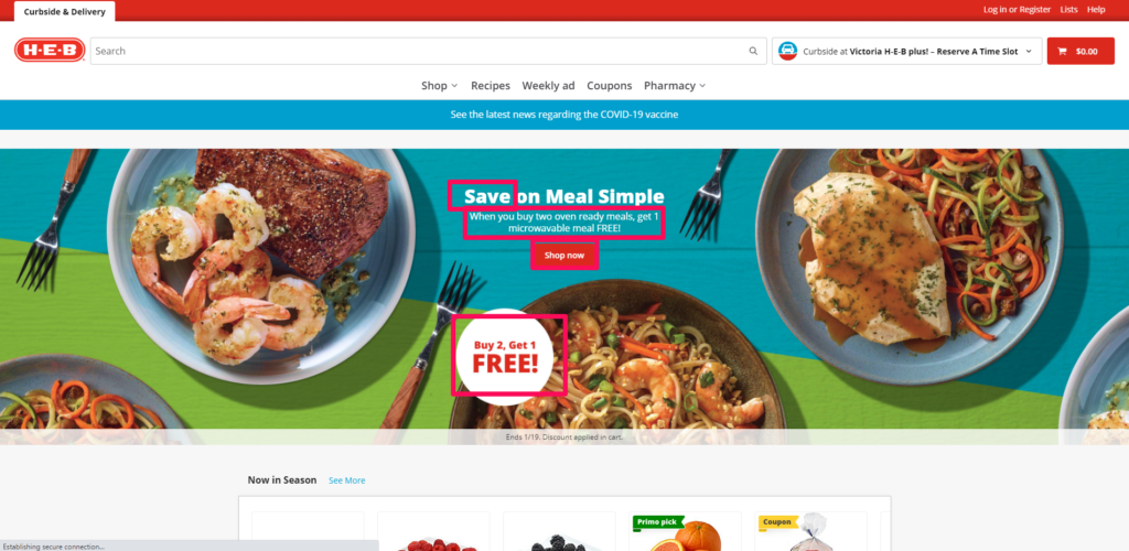
This example comes from HEB’s website; notice what we have drew a pink square around. The hero image at the top is using a nice big headline that says, “Save on Meal Simple.” The word SAVE is being used to create emotional appeal to entice the user to shop there to save money.
You also see the words FREE being used a few times as another method to encourage people to shop at HEB; in the WordStream article we mentioned earlier, “FREE” is one of those words that can also encourage visitors to become customers (it is certainly one of the most powerful words to use in marketing!). Everyone likes to get free stuff, right?
Finally, notice that there is a call-to-action button immediately below the two main headlines. Notice how the user does not even have to scroll all the way through the homepage to act. The headlines simply tell the user everything they need to know and give them the option to act without having to scroll through endless paragraphs and pictures.
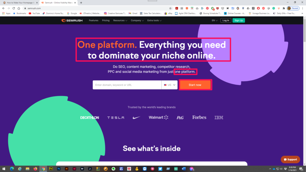
This next example comes from SEMRush, a company that is focused on providing Search Engine Optimization services.
Notice how the words “one platform” are used twice in both the main headline and then in the byline that follows it. That is because they want visitors to their site to understand that they can do everything that SEMRush has to offer in one place (eliminating the hassle of having many different content marketing companies and tools providing different services).
After going to straight to the point, they then have the call-to-action placed directly below the headlines (similar to the example from HEB) where the customer simply has to type in their website URL or relevant keywords. The start now button will then take the user to a page to create an account.
Did you notice that both examples use about one or two headlines at the top of their homepages at the most, followed by a call-to-action button immediately below them? If you can write an enticing headline, cover everything the customer needs to know in only a few words and eliminate scrolling through the homepage altogether, then you can capture attention very easy.
The most important questions you should be able to answer to your audience are:
- Why do I need to buy this product?
- Why should I buy this product from you instead of from a competitor?
Always put consumer value as your point of emphasis when trying to explain your products and services to your customers; think about what your competitive edge is (what sets you apart from your competition). Remember, if your company does not have a competitive edge then customers do not have a reason to buy from you instead of from a competitor.
Things to Avoid Placing on a Homepage
One mistake many people make when writing their homepage content is writing about things that can be placed elsewhere; the homepage should be used for communicating value and giving a very brief introduction of your products and services (with an enticing call-to-action).
Types of unnecessary content you may have seen on different homepages include company history, photos of employees and photo galleries. Now these items certainly do belong in your website, but they do not belong on the homepage! Content like this belongs on their own pages; for example, information about company history can be placed on an individual page called “About Us” or something like that. Photos of employees introducing your team can also be placed on that same page.
Secondly, you do not want to include any elements on your homepage that may annoy your visitors or seem intrusive. For example, you should avoid using videos that are set to play automatically (known as autoplay) upon page load; this can scare the user and cause them to leave. On a similar note, avoid using any background music or unexpected sounds as this can result in the same thing.
You should also avoid the use of random popups as this can cause the user to get sidetracked from the main message at hand; you should especially avoid using popups on mobile users for two reasons: popups can be extremely user-unfriendly on mobile devices and Google will penalize sites that utilize them on mobile sites because of said reason.
Things to Focus On
Your homepage should be focused on creating user engagement by enticing them to act immediately, as mentioned earlier.
Are you running any promotions or specials? Offering discounts via coupon code? Let them know and be upfront about it!
Do you want your customers to be able to contact you (they are going to have questions, especially if this is their first time getting to know your company and its products/services)? Make sure that you have a contact form with an enticing headline over it. Example: “Contact us for a FREE consultation. No obligations!”
Talk about the benefits of your products and services and explain why they should purchase them. Can you back up your claims with customer testimonials? Include reviews and case-studies that visitors can get a quick glimpse of.
Most importantly, make sure that your content is optimized for SEO; if you ignore this step, then do not expect your site to rank well on search engines. Check out this guide from Search Engine Journal to learn more!
Conclusion
Now that you have finished reading this quick guide, we hope that you are now ready to start creating an awesome homepage; one that will convert visitors to customers quickly. Do you still have questions? Do you need assistance getting started on anything discussed in this article? We are only an email or phone call away. Contact us today for a FREE consultation with no obligation!